Why support is so important and why it acts as resistance when broken with examples and charts to help you understand technical support and resistance for any stock.
Last week I explained why technically TTK Prestige is Good Investment Above 1400 and follow up to that post I will share why support is so important and why it acts as resistance when broken with examples and charts to help you understand technical supports and resistance for any stock.
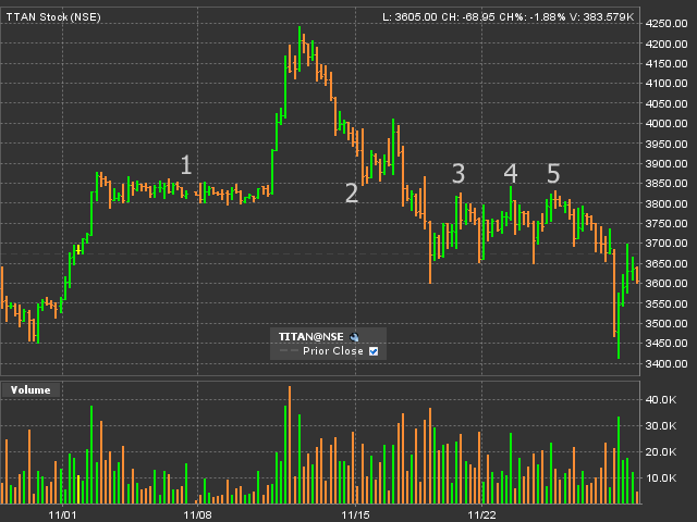
Let us see hourly chart (Each candlestick represents an hour) of Titan for 1 month
You can see some numbers in the above chart so first let me explain what they represent.
No 1 – This is the time between first of November to roughly 12th of November when Titan Industries was trading between 3800 and 3850.
As market was bullish we see a classic breakout pattern and stock prices raise.
No 2 – With the first leg of correction 3800 for Titan is clearly held. The reason such support being held is because of multiple investor sentiments. Many people think that it is a good correction for stock price to invest in and some think that 3800 was a good opportunity missed and so this can be a good entry point for them again.
In a few trading session we see support of 3800 is decisively broken.
No 3, 4, 5 – 3800 now becomes a strong resistance. Three attempts to break out of 3800 resistance but as the market sentiments are not very bullish the stock forms a triple top and remains below the key resistance level.
Friday was a shocker for markets and as expected Titan tumbles more because it was already trading below the key support of 3800.
Why the support becomes resistance?
The answer is sentiments. Neither the fundamentals of Titan changes at 3800 nor they change at 3600 or at 4200 but what changes are investor sentiments. 10+ days of stock trading in 50 Rs range and so there can be lot of category of investors who invested in this stock.
Many investors who had this stock saw a price rise up to 4200+ and now when the sentiments turn bleak and stock trades below their purchase price they think that if they can get capital back they are fine and so lot of people start selling at the price closer to the purchase price and so the support for the stock becomes a resistance.
The other group of people are short sellers who believe that as stock is below a key resistance level and as market sentiments are not very bullish it is the right level to short the stock.
Friday was a bad day for market where major Indian index swings were in range of more than 20% from high to low but I predicted TTK Prestige has support around 1400 last week only and you can clearly see the same from the Friday chart of TTK Prestige.
Apart from a bleak 40 minutes of trading below 1400 most of the time stock remained above 1400 and also bounced of the support of 1400 thrice on a day where complete sell off was on indicating it is one of the strongest support for the stock.
I hope this helps many small retail investors predict support and resistance for stock.
Share your views and feedback in comments below.


shabbir sir,
hi,
I have read your blogs,and ebook sample lessons I want to buy,but still i want to know that reading charts,for daily trading,At present i have taken sharekhan demat account.so please let me know that can i use sharekhan software for charts,because from your lesson i have tried but not understood properly.
Have you tried my book on chart pattern?
Shabir,
Good to see your new post. You explained it well with a clear graph. Please let me know where I could find such hourly and daily graph on net.
There are another cluster of candlesticks are at the bottom side. What does it represents. It look like the number of stocks traded during that period.
Candlestick show datas very clearly. There are two color candlesticks ( green and orange). Can I know why there are two different colored candlesticks? what they represents.
Waiting for your response. Thanks in advance.
Salm
Salman, Below is volume graph and green stick means uptick in the time period and orange means down.
Also You can use Google Finance and Yahoo Finance to get those kind of graphs as well just make sure you change the default settings.